This week the #MozNewsLab launched with two guest speakers. Their topics and discussions were quite different, but the major takeaway for me was to rethink design. Design is a major weakness for my personal projects (code first, aesthetics later, if ever) so I focused on the design processes shared by Mozilla's Aza Razkin and Storify's Burt Herman.
The first surprise for me was that both of their designs began with a radical new interface, then iterated toward more reliable and user-friendly interfaces. I was used to hearing an opposite strategy of using designs that are familiar first, than iterating to bring in your new ideas. That's the general idea behind the UI in a community mapping project I worked on, olpcMAP.net. There are some advanced features but they're neither essential to using the site nor highly visible. I'd like to have a chance to make a brand new UI like the flying windows and tags from one of Aza's examples, a design that's completely different and makes no apologies about it.
In the case of Storify, it's clear to see why a new interface was important in a functional way. Their goal was to reach a new audience for whom the old interface, the typical pattern, wasn't working. They take the streaming Twitter widget, with its minimalist, faster-than-thought feed that web users have gotten familiar with, and lets journalists and regular folks curate it. When the Tweet below became national news, a great deal of people had no idea how to parse it as a conversation:
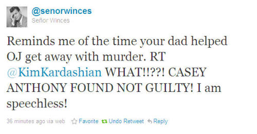
With additional design and context, a deeply-integrated Tweet, with RTs, @s, and #s, can appear in a news article without taking readers out of the story.
Storify's talk also touched on the strategy behind a startup, the most interesting point being comments about choosing a team of co-founders. Getting the right people is your classic bank heist movie -finding the people with the right skills, getting them to work together. It's a mistake to believe these people have to have the same mindset or background. A company with one person or idea determining all of the code, design, and user support is like a country with one person as judge, jury, and executioner. There's centralized control of the project but the result will be a brutal, totalitarian design.
I'm looking forward to Friday's class with a visual designer from the New York Times. Finally maps and charts, some familiar territory for me! I'll try not to mention their Bahrain map which I used in an example for a P2PU course.
The first surprise for me was that both of their designs began with a radical new interface, then iterated toward more reliable and user-friendly interfaces. I was used to hearing an opposite strategy of using designs that are familiar first, than iterating to bring in your new ideas. That's the general idea behind the UI in a community mapping project I worked on, olpcMAP.net. There are some advanced features but they're neither essential to using the site nor highly visible. I'd like to have a chance to make a brand new UI like the flying windows and tags from one of Aza's examples, a design that's completely different and makes no apologies about it.
In the case of Storify, it's clear to see why a new interface was important in a functional way. Their goal was to reach a new audience for whom the old interface, the typical pattern, wasn't working. They take the streaming Twitter widget, with its minimalist, faster-than-thought feed that web users have gotten familiar with, and lets journalists and regular folks curate it. When the Tweet below became national news, a great deal of people had no idea how to parse it as a conversation:
With additional design and context, a deeply-integrated Tweet, with RTs, @s, and #s, can appear in a news article without taking readers out of the story.
Storify's talk also touched on the strategy behind a startup, the most interesting point being comments about choosing a team of co-founders. Getting the right people is your classic bank heist movie -finding the people with the right skills, getting them to work together. It's a mistake to believe these people have to have the same mindset or background. A company with one person or idea determining all of the code, design, and user support is like a country with one person as judge, jury, and executioner. There's centralized control of the project but the result will be a brutal, totalitarian design.
I'm looking forward to Friday's class with a visual designer from the New York Times. Finally maps and charts, some familiar territory for me! I'll try not to mention their Bahrain map which I used in an example for a P2PU course.
FOSS projects often shy away from the classic "design first" approach. Its more like Analysis, Design, Develop, Implement, Evaluate. The FOSS approach gives us rapid release and quick course corrections, but it does so at the risk of not looking at the full picture. It really depends on the scope. Nothing is designed to last forever!
ReplyDeleteOne of the reasons FOSS projects work though, is because of the Unix approach to keeping programs simple. The scope of a program is simple and limited. cat does one thing. more does another. Need both? Combine them. cat | more
In large monolithic projects, a good design goes a long way, but it sacrifices relevance. A project that follows the classic approach may take five years to complete. If done right, it will serve the original purpose. However, the nature of the problem may have changed in five years :-)
I personally like the Unix approach. Build programs like Lego blocks, and then connect them as you see fit. Reduce the scope of each program until it is simple, Reuse components to make all kinds of things, Recycle code when purpose is served and build something else!
So how do last week's lectures apply to the idea(s) that you're developing in the lab?
ReplyDelete-- Phillip.
@Phillip:
ReplyDeleteAt this point I have a couple of working prototypes - one from the contest, one on my laptop - but the designs are clearly lacking some soul. Seeing the radically different UIs makes me want to work at trying something new. So now I have a number of thoughts which boil down to "how can I design better?" And if my lack of aesthetics holds the idea back, then I should make an appeal to people who do understand design.
The newer idea involves Popcorn plugins ( http://jsfiddle.net/tNhyt/14/ ) that I'd like to place onto a designed page, like this quick mock-up ( http://mapmeld.com/mojo-ex.html ) to make interviews more engaging between reporter, subject, and commenters.